
Portfolio
Here is what I did for my high school art portfolio
Artist Statement
Several of my pieces deal with perspective issues in particular because I observed that problems are created or aggravated because of the failure or unwillingness to empathize and compromise with others. Therefore, my pieces, which I convey ideas through in the form of interactive pieces and sculptures, aim to challenge the viewers’ perspectives and encourage them to reflect on themselves.


You will find three similar illustrations overlapped by the others; and in each one of these illustrations, you will find a huge laptop placed on a huge desk, a tiny bed lying at the bottom, and a tiny window located in between. I exaggerated my desk and my laptop because never before had I spent so much time with them. During quarantine, interestingly, I gained much more aware of what was happening around the world by staying a distance away from my close community in Saratoga. In this drawing, I aim to demonstrate the feeling of timelessness through the sequences and overlapping of each illustration. The window metaphorically represents my feeling, filled with repetitively and diversity, about the approaching adulthood surrounded by overloaded information during this period.
Quarantine

In a cozy afternoon, I was wondering about how tea would taste if they were made in different kinds of settings. I looked around my house and garnered interesting containers: a decanter, a fruit plate, a Chinese-style vase, a Western-style vase, and a medicine container. Finally, why didn’t I specifically call this piece “Afternoon Tea”? That’s because it doesn’t necessarily have to be specifically tea either. When I was making this piece, I also thought of afternoon coffees, afternoon wines, and afternoon juices.
Afternoon

I recomposed human parts–––“Spinal meninges,” where bones meet muscles –––with the human bones then distorted them into a fictional, monster-like creature. Though this creature was made of bone, I tried to make it look lively to juxtapose between life and death, hardness and softness, internal and external, as well as reality and fiction. I decided to make one tip of this creature go out of the border to foster the interaction between the viewer and this art. Being someone who had a passion for creating stories, I want to demonstrate that humans have an innate desire to create and absorb stories. This creature can be a dragon, a decoration, or an exotic instrument; actually, that is up to the viewers to decide, for what came into the viewers’ mind represents their character, interest, or belief.
Monsterial
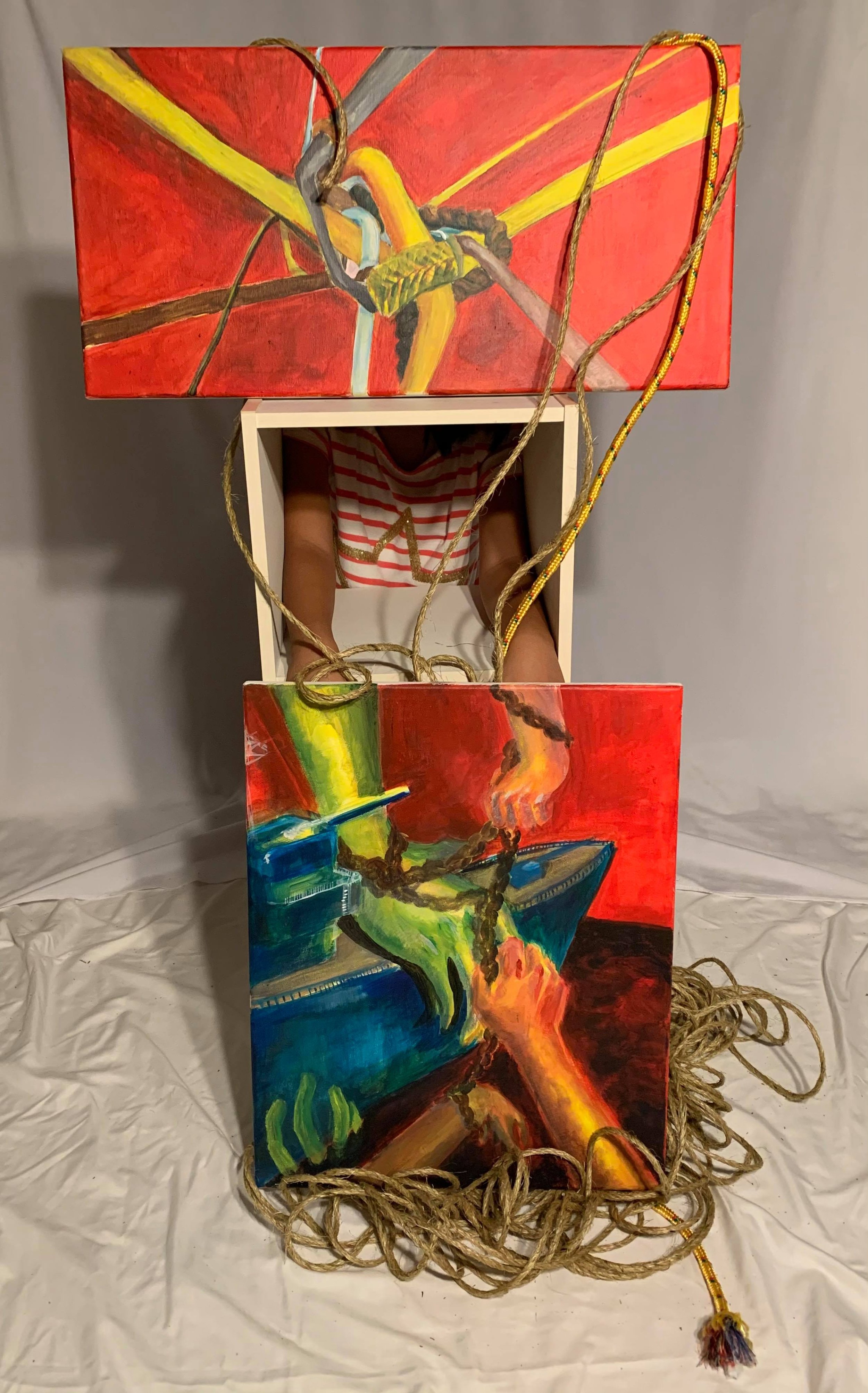
East vs West Medicine Box

This sculpture is a medicine box with two sides, the West and the East. The West box is represented by the iconic “Red Cross” logo while the East box has a “Chinese Medicine” label and a knob used commonly in classic Chinese-style medicine drawers. The interiors of the boxes are filled with elements of East and West medicine that showcase the contrast between their concepts. The hinges tie the two cultures together; however, the joints of its lock are displaced. Ironically, they cannot fully close together, just like the dolls would never fully understand one another because they are fixed in their own “bottle”! In addition, I drew some Chinese landscape paintings to make the Eastern box more interesting.
This is the second part of the East vs West Medicine Box. I intend to use the spacing to draw attention, causing the viewer to view from left to right. In the first picture starting from the left-hand side, the two boxes seem closed. However, as the viewer's eye proceeds to the right, that connection starts loosening. The disconnection was further emphasized by the focus shot of the unfitted joints of the box. This art can be viewed from right to left too. In this case, the meaning can be the opposite: although there are differences in perspective and culture, there are similarities among us humans. Through this art, I wish to demonstrate the importance of perspective in ironic ways. From thumbnail sketches, and found objects to the box choice came through a long journey and it is one of my proudest pieces.

Sketch: Warship
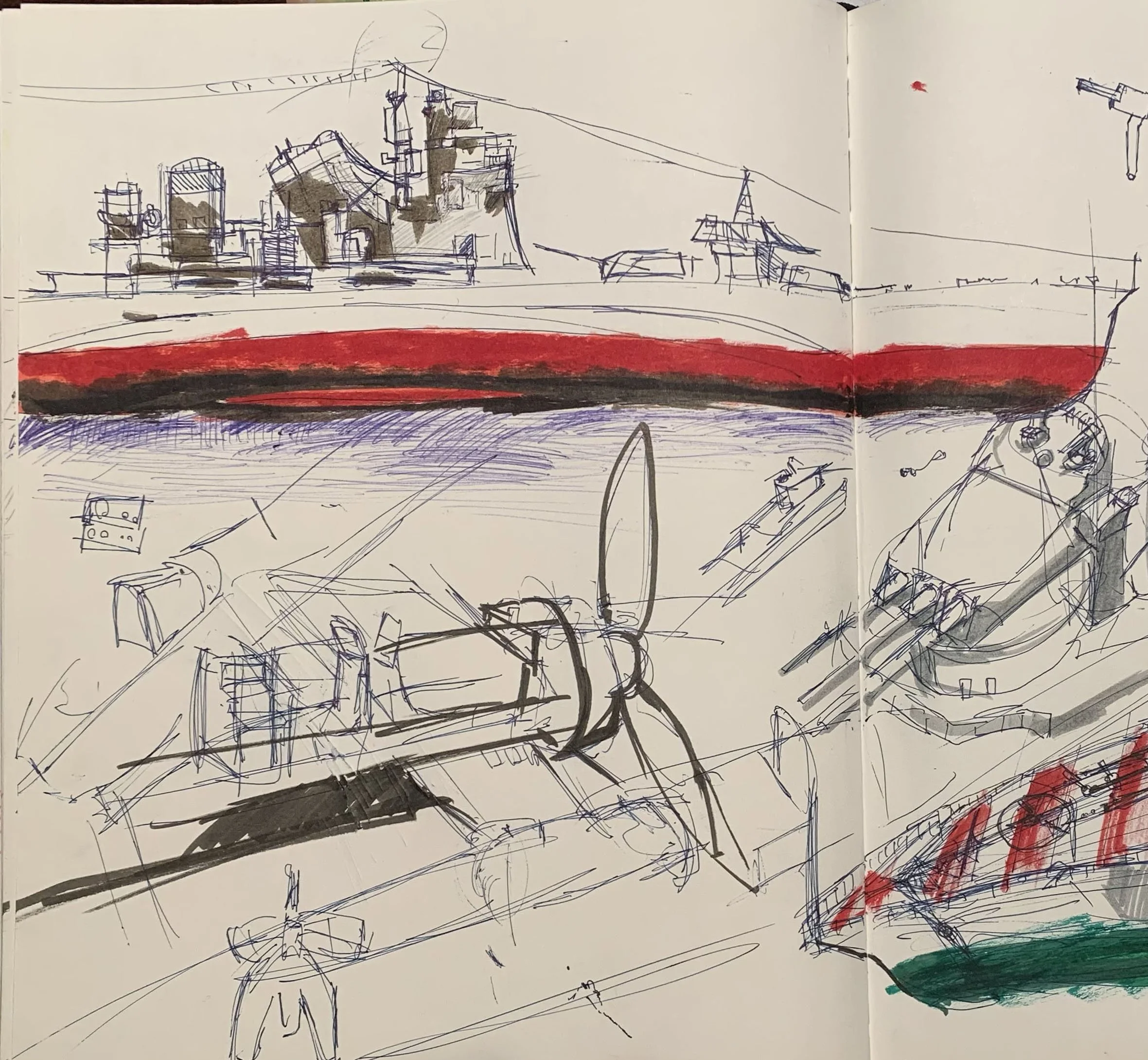
This sketch demonstrates my interest in and love of history. Each sketchy stroke in this piece was a joy not just because I loved learning about mechanics or machineries but also because I felt satisfied each time thinking about the structural beauty of a functional design, especially those of the boats. Although war histories are filled with pain and disruption, they also display complex humanity vividly. As I sketched the warships and planes, I immersed myself in wondering what the past has taught us.
Sketch #2

This is another sketch and observational piece. But unlike the last sketchbook piece(Sketch––Warship), this one includes my thumbnail sketches and other conceptual ideas. At the top right corner are interesting designs I came across when I was thinking about alternative forms of warships. The pen sketches on the left page were the original ideas of one of my portfolio pieces (International Relationships). In this sketch, I had an idea about demonstrating complex human/societal relationships by incorporating ropes. I first planned to create my work either through painting or taking photography of people posing complicated postures. However, as I progressed through my thoughts, I eventually combined the two ideas (see International Relationship).

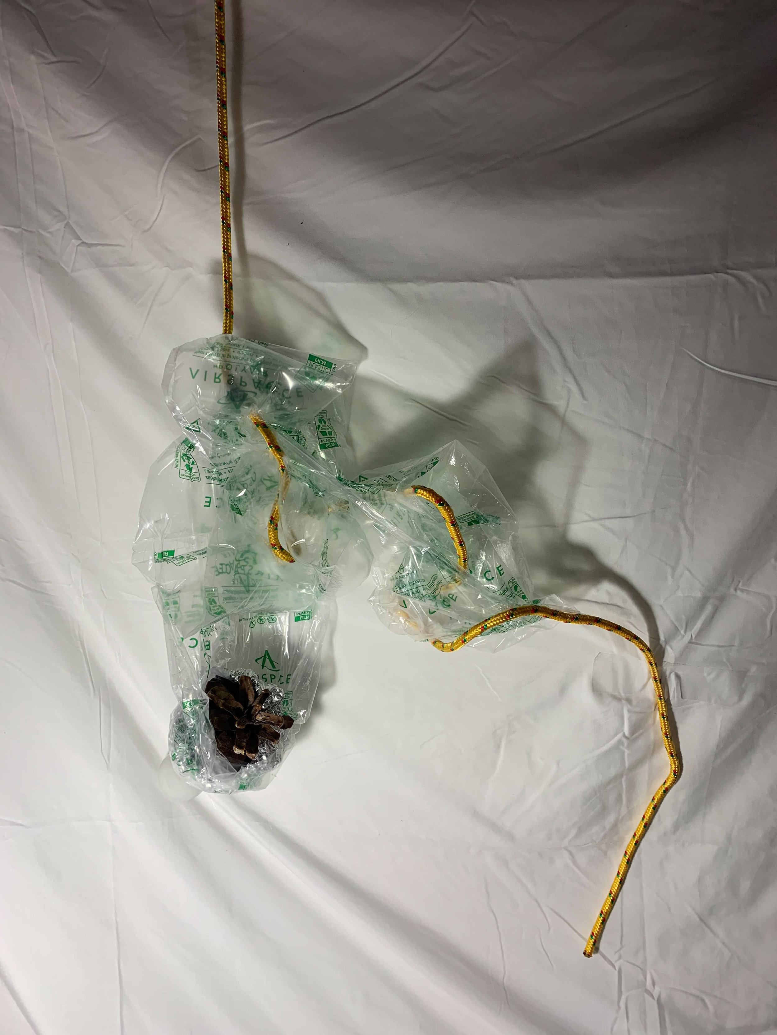
I wrapped the lightbulb and pinecone with plastic to symbolize the waste we created. The lightbulb represents our value to “great civilization” and technological advancement. Those achievements were only made possible because of nature–––the pinecone. However, the shadow of the plastics and the rope that seems to be loosening all make a statement that humans will eventually face the consequences of our relentless usage of natural resources. This piece is an irony.
Overdosing
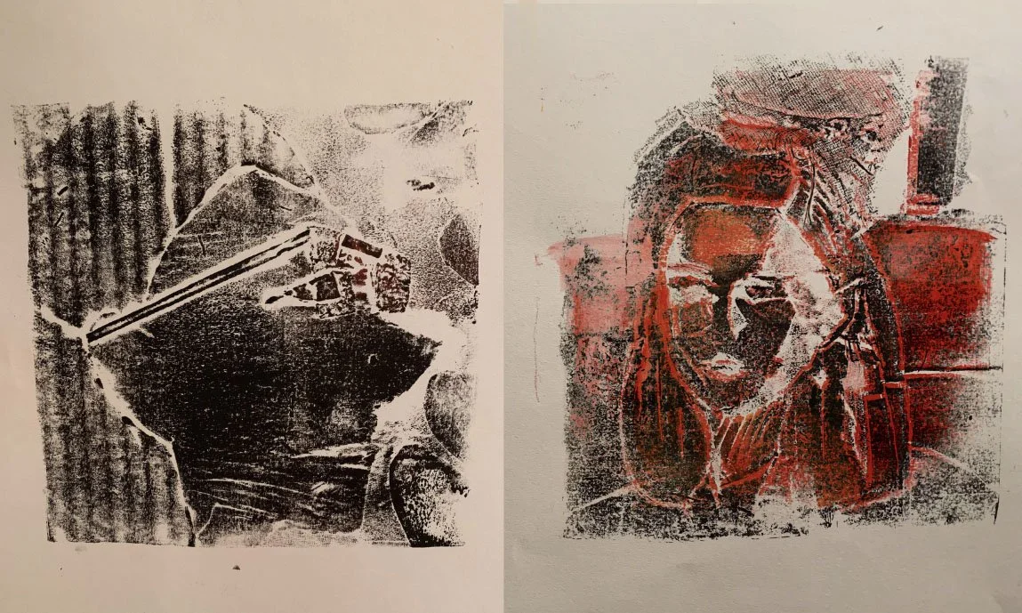
This is a fun piece that depicts and compares different angles of my face: one on ordinary days (left) and the other one on a formal occasion (right, me when I went to my cousin’s marriage back in November 2019). Although they are both self-portraits of me, they seem to show different personalities. Perhaps, different occasions or clothing do have some impact on my mood. Still, both of them are me since they match so well with each other in the funny or suspicious way they look at one another, in a different way.
Self-Portrait
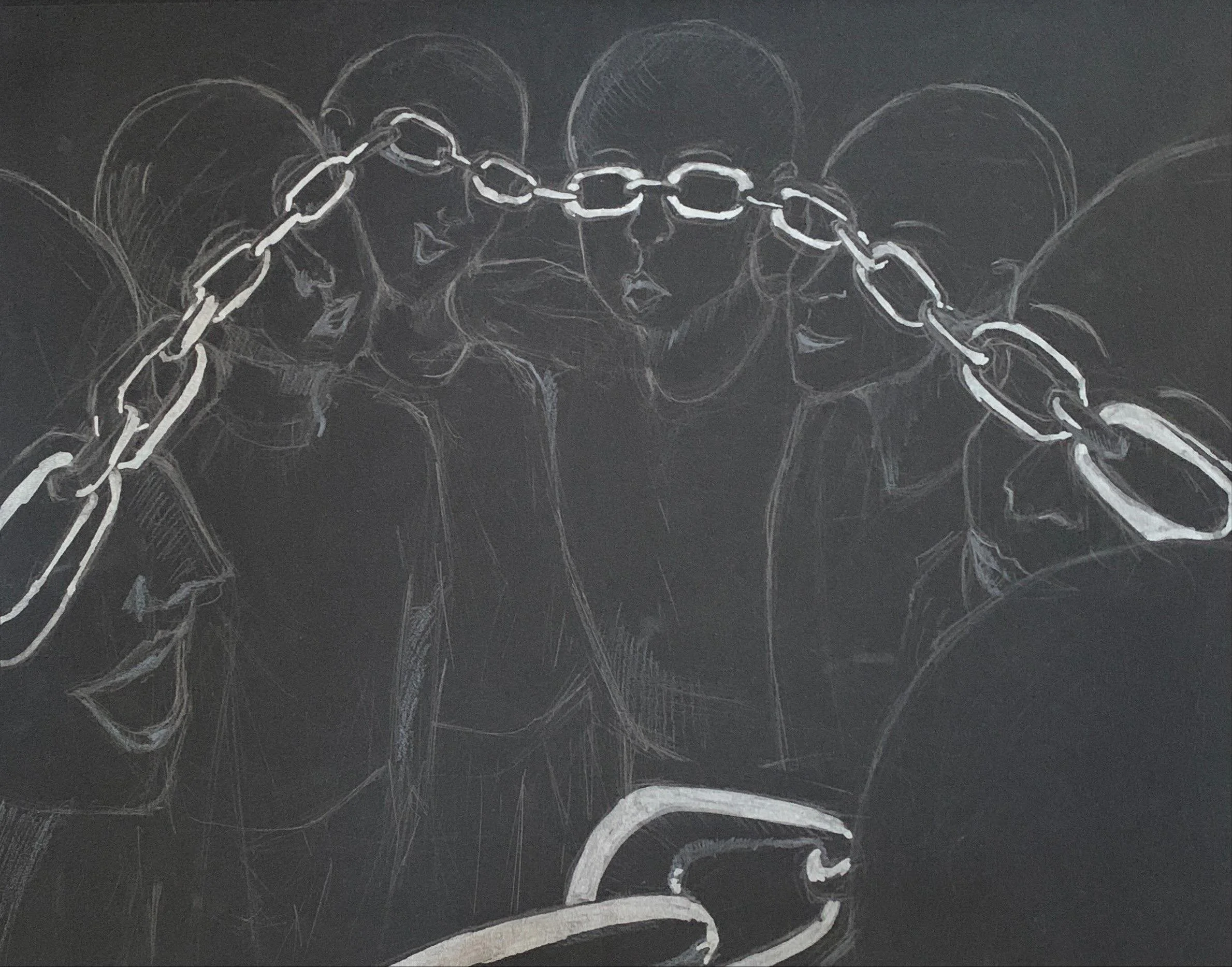
The chain that connects these people are also glasses. Because of propaganda and misinformation, people have a distorted view of the truth. The smiles on their faces creates an unsettling mood and the chain that comes toward the viewer gives a sense of presence. Unsettling, the chain goes in a circle and toward the viewer, demanding them to gain awareness of misinformation and perspective bubbles.
Chain-Glasses
This piece contains three parts: a painting at head position(hereinafter, “Head Painting”), two hands of a real human reaching out (middle), and a painting on ground (hereinafter, “Ground Painting”). The Ground Paintings illustrated the two sides of conflicts (represented by hands)- the green (trying to take the warship and start wars), and the smaller hands(preventing that through holding chains). The fact that the two real human arms are connected to both sides of conflicts showcase the struggle to reach a balance of powers. Conflict of interests makes it challenging to reach a solution and agreement, just like the ropes in the Head Painting.
International Relationships

Finding things often are difficult task for the elderly who can’t remember well and for those who can’t see well. Thus, I designed the Trackable Stickers—stickers that are identifiable by their Barcode numbers and Braille. Since too many stickers might confuse the user, I design an App that stores information about the stickers such as the names of the objects that the users stick their stickers with. The AI (“Minion”) in the app will help guide the user to the location of the object they want to find. For example, if the user asks Minion AI, “Where is my pencil case?”, Minion will reply, “Pencil case, sticker #5 is located in your office 5 meters away”. To make it even more convenient, there could be another function for identifying what other “stickered-object” is near the item of interest. For example, Minion can reply, “object 5 is on top of 8, your working table”. Although I don’t have the experience or resources to actually make such a product, this idea is a good place to start.
D-Stickers
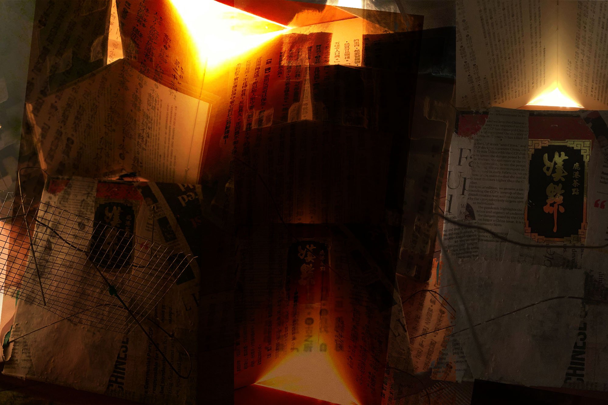
I created a mysterious, ancient yet captivating atmosphere to make a commentary on how traditions are constraining, and thus deleterious to us. The rectangular object that is laid on the ground is a paper mache box. Because this sculpture is set on the ground level, the viewer will have to lower themselves to get a clearer view. While doing so, the whole sculpture suddenly looks tall. The light behind the sculpture made the whole piece look bigger than its actual size and thus attracts the viewer’s attention toward the book. But ironically, the book is upside-down. Similarly, the paper mache piece is also filled with twisted metal wires that oppressively encircle the environment. This juxtaposition between the warm scene and strange arrangements demonstrates how some outdated traditions still relentlessly restricted people till this day. Finally, I edited my photos by overlapping my photo in order to increase the intensity of my work; this included making the light look like fire.
Traditionality
Gender Norms—A Series
I carved a foam block into human lungs. Though the lungs were divided into two sides and were slightly different from each other. One side was as important as the other side. Both sides were seemingly indifferent to the other as both possessed the same white color from the beginning. Until I sprayed one side pink and the other side blue, the stereotypical color for girls and boys. In the second part of the video (setting: in the dark storage space), I sprayed both sides with the opposite color, representing the progress we had made throughout modern times. However, both sides remained largely the same, just as gender norms still stubbornly remained. Ironically, in the final parts of the film, the close shot captured how the sprays are decomposing and damaging the lungs subtly. As the video proceeded, the tension also increased. The disproportionate effect of covid to working women, particularly working moms, was the inspiration of this bold piece.

# 1
This is a photo of the lungs after the initial spray (see the first part of the video). I adjusted the brightness and contrast of the photo to strengthen the aesthetic effect.
#2
This is a clear portrait of how this piece looks like. After I sprayed the lungs, I used my hands to squeeze a pomegranate to further create and deepen the impression that the lungs were bleeding and damaged.


#3
The lungs are covered by plastic with an old, rotted chain hanging on one side.
The motion of this photo creates a mood of unsettling feelings.
#4

#5
This piece is a more modern rearrangement of my work. I edited my photos to create a new interpretation of my sculpture.
Identity

I aimed to make a piece suggesting that beyond the environment that shapes us, we are all humans after all. In the top left-hand corner-box, I illustrated a figure of a person whose hair was filled with different colors that are associated with different races’ hair. Similarly, the five fingers of the single hand in the bottom left corner showed different skin tones and were shaped as if each of them were from a different person’s hand. The big eye in the middle right-hand side was related to the person at the top left-hand corner because his/her eyes were covered. However, I left the big eye uncolored in order to make its “race” ambitious. Together, these boxes portrayed a person who left his/her identity, race, or gender, unanswered, which invited the viewers to think about how the “same” person could be affected due to a different environment. Finally, I enhanced my idea by making the background––a paper frame attached to a cloth hanger––exchangeable.
Portraits of Mine
In this piece, typing my name resulted in my portraits' production. Each paper(portrait) printed represents a different period of my life; because, to me, my name's meaning varied over time. The paper's front side is literal descriptions, while the back(reflected through the mirror) is my portrait for the associated periods. The portraits can be briefly summarized as:
First Portrait: childhood, culture, heritage
Second: Adolescence struggles, transition, self-doubts
Third: Overcome struggles(looking at the second portrait with determination), confidence, and ambitions,
In short, I created a self-portrait that is evolving and interactive, demonstrating my growth while depicting my unique identity.